Friday, 17 December 2010

Choosing a Cover Lines and Title and Cover lines


To match the picture on the front cover, I had to choose a font to correspond with it. Consequently, according to the title URBAN and the baseball jacket my model is wearing, I had to pick a 'OLD SCHOOL' type of font.

The fonts I strongly considered are on the left hand side.

The decisions I made were:

-TITLE- 2nd one down
-COVER LINES- 1st, 3rd and 4th URBAN down the list.


Chosen Photo

This my chosen photo to put on the front cover of my magazine.

This is because as I showed earlier in my research, URBAN music originated from African Americans, so Chima is a perfect representative for this genre of music.

He is dressed up wearing URBAN like clothing and is looking into the camera catching the readers attention .i.e. making eye contact with the viewer. This contact is also reinforced with the fact that he is pointing towards his eyes exemplifying the eye contact attracting the readers attention.

Planning of Front Cover

I have used photoshop to plan the front cover of my magazine.

I shall stick by this unless any changes need to happen.

It is a simple design but works effectively representing URBAN music.

Thursday, 16 December 2010

Colour Scheme

COLOUR SCHEME

The colour scheme I have decided to do for the front cover of my magazine is RED, BLACK, and WHITE.

These contrast nicely with each other making different parts of the magazine stand out. Incidentally, there will be no information o cover lines on the front cover that will go unseen.

Monday, 13 December 2010

Facts About Urban Music

URBAN MUSIC consists of many different categorises, however the main one is R&B MUSIC, which I will include in my magazine to appeal to my target audience. c

R&B stands for Rhythm and blues music.

History:

Rhythm & blues music was one of the most popular genres of music in the African-American community from the 1940s to the 1960s. This was because of the huge job growth that took place during World War II, a younger black audience rapidly moved from rural towns to urban communities. In 1949, Billboard magazine renamed its "race records" chart to "rhythm and blues," as the social and economic landscape began to change for African-Americans. From then on, this music continued to develop into one of the most largest music industries in the world. However, URBAN music we have to day differs from the original in many ways. The modern day music has a much more upbeat rhythm including mixtures of singing and rapping within

the same song, where as originally, URBAN music mainly consisted of music genres such as REGGAE.

Consequently,

R&B music broke away from the more traditional "big band formula" of earlier years, and

R&B artists began performing in small, musical combos. The music tended to emphasize blues-style vocals and song structures. Like in the bands of the big band era, saxophone and piano were still present, but electric guitar and bass started to add a different power and electricity to the music, which translated well to radio and jukebox play.

UK Tribes Research


UK TRIBES believe URBAN music is the most pervasive and influential genre in popular music, topping the charts around the world and sound-tracking the lives of many different Tribes. Members of the URBAN segment are therefore very close to one of the biggest cultural signifiers in the youth market


URBAN music artists include in KANYE WEST, BEYONCE and RHIANNA


Thursday, 2 December 2010

Photos for my Magazine


After taking numerous photos for my magazine, these few are of the best quality and appeal most to the target market.

Title of Magazine and Target Audience

TITLE OF MY MAGAZINE

The title of my magazine will be 'URBAN,' thus the theme will be urban music. Initially, the title ideas I came up with were VINTAGE, OLD SCHOOL, OLD SKOOL, URBAN, and UP-BEAT, however, after researching into the most popular and suited name URBAN received most votes.

My market research consisted of a survey for 37 people to fill out in which most name appeals to them for URBAN music. My findings were:
URBAN- 28 votes (76% of votes)
VINTAGE- 5 votes (13% of votes)
OLD SKOOL- 4 votes (11% of votes)
OLD SCHOOL- 0 votes (0% of votes)
UP-BEAT- 0 votes (0% of votes)
My market research consisted of approximately 90% people enthusiastic about URBAN music, of mixed ranges from 14-32. Coincidently, my target market will be male aged 16-32.

This is a picture of participants completing the survey.


Wednesday, 24 November 2010

Magazine Analysis- Vibe

Inside

This weeks issue of VIBE contains 121 pages in which 61 of those are adverts (just over 50%). These advertisements can be categorized into types; cars, music gigs, drinks, cosmetics, technology and fashion.

Furthermore, the article topics consist of many interviews with urban music artists, facts and news stories about famous celebrities interested and involved in urban music, and also articles about latest technology. There are 31 double page spreads all but these categories.

For example this double page spread is about Ushers rise and fall of his life. There are similar stores to this every issue. There are also not many advertorials in the magazine.


This magazine achieves a unified house style by continuously using rather colloquial language throughout the entire magazine. This is used to create a sense that the magazine is almost talking to the reader, thus articles are seen as being interesting for the targeted age to read, unlike a complex articles that can be seen as being more of a boring chore to read rather than a relaxing and enjoyable. Furthermore, the same layout is continuously published consisting of boxes for interviews with pictures organised in columns. Where as, within stories of music celebrities, only small amounts of large pictures are used taking up a large majority of the pages.

The text is always laid out always three columns of writing.


Similarly, the font is the same throughout the whole magazine and colours differ as well. This house style is appropriate to the target audience as it is laid out in a relaxed and easy going manner. The continuous house style also creates a rhythm coordinating with the title and the target market of urban music fans.

Magazine Analysis- Vibe

The Cover


The title ‘VIBE’ is an urban word for ‘rhythm and chill.’ This connotes the content within the magazine informing the reader what is it is all about in one single word. It gives but cool, relaxed but informative information about the magazine and what the house theme is all about. It is also the logo for the company in which the font is very bold and basic. It is all one plain colour; however, this sometimes does change according to the main article of the magazine which is published on the front i.e. the colour of the background changes. The logo is right at the top of the page always taking up almost a quarter of the front cover. This stands out from the magazine and immediately catches the viewer’s attention due to the fact that is easy on the eyes, as a consequence of its short name, but also very large which stands out in your face. In addition, this font and logo corresponds to the definition of the title as it is written in a bold and relaxed way, not overloading the reader’s brain with lots of colours and edgy shapes like in other magazines such as ‘KERRANG.’ This emphasises the ‘chilled’ mood. Therefore, this could also be the reason not to have a strap line (not overloading the brain with words to keep the ‘chilled’ theme.

The main image is a medium long shot of the R and B singer, Usher. He is wearing vintage pilot uniform standing in front of a U.S.A aeroplane. His facial expression appears to be looking ‘relaxed’ corresponding with the title. Sun glasses are the main feature of his face adding to the vintage pilot look as well as the badges, back pack, gloves and helmet he is holding in his right hand. This gives the impression that he ‘means business’ which accustoms the font lines matching the picture ‘Usher. There is no competition.’ Consequently, the look of a U.S.A army pilot creates an image of respect and dominance in which he can beat other music artists in the industry. Similarly, the army uniform accustoms the name of the singer ‘Soulja Boy’ thus, he is seen as a threat which creates tension upon the front cover of the magazine encouraging the viewer to buy and read it.

The main figure is in the middle of the magazine in front of the title. His eye-line is purposely equal with it as the viewer would always firstly look at the eyes of the person, incidentally they would then see the title behind it. This is another method of attracting attention to the logo which immediately imprints into the persons brain due to the short one syllable title. This also advertises the magazine as even if the viewer does not pick it up, due to the instant imprinting of the magazines name it can be spread through word of mouth.

There are no other images on the magazine as the publisher does not want to overload the reader with too much information which could contrast with the title. Unlike with rock magazines there will be more pictures overloading the front cover relating to the wild and loud music genre.

Other than cover lines relating to Usher and Soulja Boy, there are only a few other phrases on the front cover. These consist of ‘50 crazy celeb tweets’ at the left hand side printed around the main figure and ‘Meet the mean girls of morehouse’ printed at the bottom of cover, where the figure has faded. However, these all have the same font style and colours (yellow and white) that stand out from the picture. Therefore, they can be easily seen and displayed on the magazine, despite that they are slightly smaller than the two main cover lines corresponding to the main image. Furthermore, just above the title at the top of the page there are names of famous urban music artists advertised in the magazine. The fact that a lot are mentioned informs the reader that there is a lot of content in the magazine and that they will get their moneys worth. Similarly, despite that they do not have describing words with them create suspense in which the reader wants to find out why they are mentioned and what is mentioned about them in the articles. As a consequence the cover is almost talking to its reader.

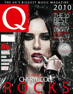
VIBE does look quite similar to other magazines such as ‘Q’ which have a similar target market. Although they do differ in a numerous amounts ways. For example within this issue there appears to be more going on within the front cover of ‘Q’ due to the fact of more colours and effects such as water creating a large effect movement. However, are still a similar layout with the text presented around the main image and the figure being in the middle. In addition the unique selling point of VIBE is its ‘chilled’ approach to advertising urban music.




Magazine Analysis- Vibe

About the Magazine

The magazine VIBE was launched in 1993 by Quincy Jones in partnership with Time Inc. Time Inc Time Inc is one of the largest content companies in the world which produces a huge wide range popular magazines and websites such as ‘EW.com’ (entertainment weekly). The VIBE lifestyle network represents over 25 websites and reaches over 19 million unique users per month. According to their website the target market is aimed at 18-34 year olds interested in urban music, entertainment, culture and celebrity lifestyle. In addition according to VIBE headquarters the median reading age is 28 with 67% of the sales going to men and 27% to women. (http://www.linkedin.com/companies/vibe-magazine)

The magazines cost £3.95 per issue and its circulation is approximately 800,000 copies a year.

Saturday, 20 November 2010

Magazine Analysis-NME

Inside:

There are 66 pages in the NME in which 18 of them are adverts (27%), however, there are continuously adverts throughout the entire magazine covering up to half a page. There are a range of types of advertisement which consist of mainly music gigs, electricals involved with music such as headphones, and clothes.

Furthermore article topics in the magazine consist of ‘NME tours,’ stories and exclusive interviews of music artists and groups, and reviews of music. There are 15 double page spreads all about these topics. There also doesn’t appear to be any advertorials

NME achieves a unified house style by continuously using very chatty and informal language. This is done to sound as if the magazine is communicating with the reader in person as if someone was actually talking to them. This is appropriate to the target audience because most 17-30 year olds prefer to read as if they were being speaking to by their friends. Therefore, it is written this way so the reader is more likely to read and find out all about the gossip in music and buy the next weeks issue. Furthermore, NME has a unified house style by splitting text into three columns on every page. Black lines are sometimes used to do this. Similarly the font and font size is continuous throughout the whole magazine other than sub subtitles and titles of the articles.

Magazine Analysis- NME


The cover does look quite similar to other music magazines such as ‘KERRANG Both titles are at the top of the page with a main image of a close up picture of a music artist. Free posters are being given away which is written at the left hand side of the page as well as large cover lines at the bottom of the page matching the picture. ‘KERRING’ has a similar target market, however it includes more rock music which matches the font and name of the title.

By contrast, they both have their own unique selling point. NME generally appears to be much brighter with a large range of different colours used. This is because it offers a larger variety of other music genres than other magazines. Therefore, it needs to include a variety of colours which are not consistent throughout such as black with ‘KERRANG’ with a target audience primarily aimed at rock. The title is always distinctive as it is in exactly the same place of the front cover but also changes colour according to the pictures unlike other music magazines.


Magazine Analysis- NME

There are three other images of ‘free posters’ on the bottom left hand side of the page. This reveals some of the content of the magazine therefore, the reader knows what they can find out if they buy the magazine. The fact that they are ‘free’ makes the reader believe they are getting more out of the magazine than just news stories on famous singers. The name ‘Mick Rock’ is highlighted red matching the red hair and also standing out from the writing as this is a very well known artist that the target market would love to read about, thus it helps to sell the magazine.

Other content promoted on the cover lines are ‘Suede comeback interview’ written in simple black font, similar to the title. These three words keep it short and sharp revealing information within this weeks issue. This short phrase almost builds up tension upon the reader, as they feel they must read it especially due to the fact that it’s a ‘comeback.’ Like the name advertised with the free posters, the name ‘Suede’ is also made to stand out. However, this was by making the writing bigger rather than a different colour. This is most likely because it is at the top of the magazine near the celebrities red hair so it wouldn’t stand out as much. Also, it reduces to much repetition making the front cover as admirable as possible.

Likewise, the cover lines on the right side of the page reveal other music artists inside the magazine. Each one stands out from each other due to the flow of bold writing at every other name. Positive words are used such as ‘amazing’ glorifying the artists and advertising the magazine, emphasising the fact that its un-miss able and if the audience does not buy it they will miss out on the ‘amazing line up revealed.’

At the bottom of the page the same font as the title as this is the most important story in the magazine. It matches the main image on the front cover and a play on words is used ‘Gerard sees red’ as the famous singer has red hair standing out on the page. Furthermore, the colour red is also associated with ‘romance’ and love in which the cover lines say ‘My chemical romance.’ As well as making the story seem personal; the word ‘romance’ is exemplified playing with the whole cover story. ‘Romance’ and the red hair are some of the main things the viewer can see on the front cover. This is as if the magazine is actually talking to the readers mind as everything fits together.


Consequently, the text has been laid out around the main image to create a frame around the artists face to draw attention to him.

Magazine Analysis- NME

The main image is close up picture of the indie singer ‘Gerard Way’ from the band ‘Chemical Romance.’ His facial expression appears to be very intense. Thus, his face is slightly leaning down but is also looking up, gazing at the reader. This expression and posture reaches out to the reader because it is almost as if the singer was having a conversation with them due to the eye-to-eye contact. Therefore, this attracts the reader’s attention, and makes the magazine seem more personal, as the viewer feels as if they are actually with the music celebrity who they admire. Subsequently, this method engages the reader to pick up the issue and want to find out about the person on the front cover. By contrast, if the singer was looking in a completely other direction, there would be no eye-to-eye contact so the ideal reader would not feel as much of a connection and would not be pulled into the magazine as much.

His left hand is brushing back his red hair attracting more attention to the celebrities eye line, again reinforcing the connection with the music magazine. Similarly, his eyes are actually almost in the centre of the front cover capturing the expression and pulling the reader in.

His clothing is plain black relating to the red hair and fashion style of the singer. However, his body and clothing appear to be slightly blurred attracting the reader’s to the singers face rather than the body. This also emphasises the point about making the magazine more personal. It also contrasts with the light blue background making them him stand out as fully as possible. Furthermore, this colour contrasting technique also makes the writing on the front cover stand out as well, subsequently; it can be easily read and navigated round the page.

Magazine Analysis

The Cover:

The title of the magazine is ‘NME’ which stands for New Musical Express.’ This connotes the content in the magazine, which is all about new music. Therefore, the audience know the information in the magazine, which can appeal to them. The short abbreviation of title ‘NME’ is short and sharp, which can easily be remembered publishing the magazine and making a big name for itself despite the short title. This remembrance is reinforced by the bold capital letters that stand out. The title/logo is written in a simple way which is very basic and matches the simple short title.

Furthermore, the white title also contrasts the red and blue background making it stand out as fully as possible. However, there is not a strapline, most likely due to fact that NME are already abbreviations of the content of the magazine.


Magazine Analysis- NME


NME is the longest published and believed to be the most respected music tabloid magazine in the world according to their publishers. Its first issue was released in 1952 and is produced by IPC Media who also publish large amounts of a variety other popular magazines. For example, ‘Marie Claire’ is quoted as being ‘Britain’s leading fashion magazine.’ It is mainly aimed towards women aged 25-34, where as other magazines IPC produce such as ‘World Soccer,’ have a target market is also quoted as being adult football enthusiasts aged 18-30.

According to the publisher the target audience for NME are men 17-30 year olds with a general keen interest in music. However, the magazine does mainly contain alternative music specifically attracting late-teens, early twenties interested in that topic. Consequently, NME statistically shows that their readership are 74% male and 26% female with a median age of 23 years. Despite, this age average range it is no surprise that students make up 42% of the buyers.

According to NME’s media pack, ideal readers are young male men obsessed with music. The readers rely on the editorial and the adverts to keep them with the latest music and styles.

The magazines cost £2.30 and publish weekly. Incidentally, its circulation is approximately 38,500 copies every 6 months where as its readership is about 325,000 people a year.

Therefore, despites NME’s relatively narrow target audience it still believed to be one of the most successful music magazines at present time.

Thursday, 11 November 2010

Contents stage 4- Finished Design

This is my final design for the school contents page All the text is filled out within the text boxes where it is easy to navigate round due to the indent of the page numbers and highlighted words. Similarly, the page numbers on the picture make it even easier to navigate as the reader would not even have to see the text with it as the picture simply explains what is on that page filling the readers satisfaction.

The horizontal writing at the bottom of the page give the contents an new theme and style as well as still carrying on the original one from the front cover. For example the writing style, pictures and color are still the same.

This contents page is also student-friendly due to the bright colors, text, and simple layout. the context within the margin appeal to all students thus, making the magazine attractive and pleasing for the reader due to this happy positive style.

Contents stage 3

By this stage I have added more pictures at the bottom so that the magazine appeals to students of all year groups as well as another text box. By this stage the entire contents is planned out for text and finishing touches to be added.

Contents stage 2

Here I have added a photo of the school library at the top and large one in the middle of the page relating to the front of the page. In addition, I have added text within the text boxes and on the pictures. Therefore is laid out clearly following the same style of the front cover where the pages go in order as it is ony a short magazine rather than having specific sections like in long magazines.

Contents stage 1

This was the beginning of my contents page. I carried on the style of the text from the front
cover thus, continuing the theme. I also created a text box to set out the theme and layout of my contents page.

Friday, 5 November 2010

Finished School Front Cover

This is my finished design for the front cover of the school magazine. I used positive words and phrases emphasizing the positive aspects of the magazine, making it very appealing. I made certain words stand out such as 'maximize' to also attract the reader.

Furthermore, I used alliteration 'stip away stress,' also being the 'rule of three.' This play on words roles of the tongue creating an interest for the reader. The picture relates to almost all of the catchy phrases quoted on the front cover as well as the colours matching too. This creates a flow of the magazine rather than creating random sections that stand out from each other for the wrong reasons.

Similarly, the tittle is also a play on words which is a catchy name for all students within the school. The large 'W" sets the theme of not only the front cover, but the entire magazine giving it a student friendly feel.

Thursday, 4 November 2010

Original Picture

This is the photograph I took for the front cover of my magazine. I have edited the lighting on photo shop making it brighter and more eye catching. I have also left space for writing the go round the student and have took a picture of him working so that I can use a large variety of work related phrases.