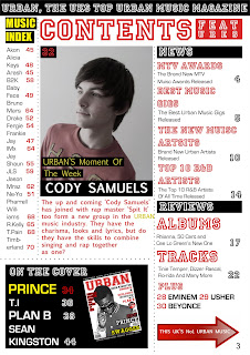
Question:How did you attract/address your audience? I have described who will be my audience in question 4, however in this evaluation question I will explain how I have addressed my magazine to attract the particular type of audience. Firstly, when looking at the front cover the first thing one sees is the bright and bold title 'Urban.'
This one word represents the entire content of the magazine and instantly reaches out to th e Urban audience drawing them in encouraging them to buy and read the magazine
. When the title suddenly catches the audiences eye, they immediately feel as if they belong and believe that they are the audience for this magazine and therefore, will buy and enjoy it, as they feel it is their job due to their interest and enthusiasm in Urban music.
As described earlier,
the model on my front cover represents the particular type of social group I was trying to attract in which is younger people interested in Urban music and fashion.
Incidentally, the baseball jacket the model is wearing belongs to the 'old school' Urban fashion sector. It
represent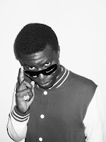 s the type of music that makes up the content of the magazine and portrays the personality of the character advertised
. Therefore, this effect reaches out and draws in people who are enthusiastic about the Urban culture. As the jacket is not to 'flashy'
the audience believe that are from a similar social class and can associate themselves with the Urban artist. This appeals to the audience in which they share their enthusiasm of Urban music with the Urban music magazine. This is also reinforced as
the model is looking straight into the viewers eyes and is of the same eye level. The image does not look up at the model portraying him as an important 'God' like figure who is of a much higher social status than the audience, and the image does not look down at the figure representing him as being of a lower status than the audience, thus they would not want to read and admire him. However, as m
y model is still wearing a sparkling dollar sign ring and 'flashy' glasses there is still
a sense of admiration in which he is still represented as being a role model, thus attracting my audience.
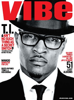
Likewise, these conventions that I have used to attract my audience are also used within this
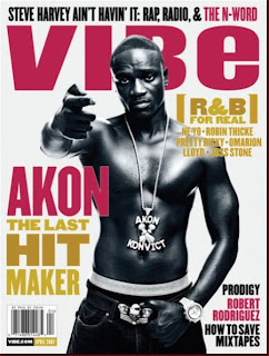
Vibe magazine that attracts a similar target market. However, a difference with the picture here is that the model is pointing at the viewer to address them unlike mine which points at his eyes to reinforce eye contact with the viewer.
Similarly, t
he cover lines on the front cover also draw in the audience.
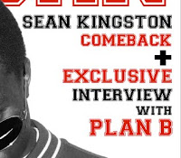
They are advertised in short sharp phrases including valuable words such as 'come back' and 'exclusive' thus, they appear to be more popular and so attract the audience.
The valuable words make them feel privileged to read the  articles advertised therefore, attracting more people to make them feel good about having the magazine
. In contrast with
Vibes magazine, the large bold cover lines draw in the audience with short sharp phrases 'Akon the last hit maker.'
If they were to see the front cover and not buy it, they would feel as if they were missing out on something special and so they would not take the risk and buy the magazine. Similarly, as the cover lines convey the article making it seem huge news due to the colour contrast, sizing of the font, highlighted and valuable words, the magazine is brought out to seem very popular. In addition, as a person believes this, they feel that it is a must to buy it to follow the trend so they do not miss out, thus the magazine is reveld as being impossible not to buy.
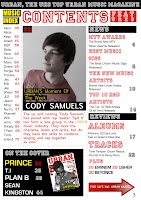
As the audience is encouraged to pick up the magazine and quickly scan through before buying it and
instantly see the contents page. Immediately they see it as being
very easy to navigate around advertising even more important articles. Consequently, as described in earlier questions, the audience believe they are
getting a very good value for money which will again encourage them to buy the magazine. Simuilarly, as I am addressing my magazine to a slightly younger age than the other Urban music magazine in the media market 'Vibe,' the easy to navigate contents directly appeals to them again reaching out to them, persuading them to buy the
magazine.







 he task I instantly came to grips with blogger. I learnt how to navigate myself round it by exploring the website and other people's own blog as well. After familiarizing myself with the network, I began to add gadgets of my own after I had setting up my own account such as necessary tools like 'labels' to make my blog easy to organize and clear for people to navigate themselves round finding needed information.


 e Urban audience drawing them in encouraging them to buy and read the magazine. When the title suddenly catches the audiences eye, they immediately feel as if they belong and believe that they are the audience for this magazine and therefore, will buy and enjoy it, as they feel it is their job due to their interest and enthusiasm in Urban music.
 s the type of music that makes up the content of the magazine and portrays the personality of the character advertised. Therefore, this effect reaches out and draws in people who are enthusiastic about the Urban culture. As the jacket is not to 'flashy' the audience believe that are from a similar social class and can associate themselves with the Urban artist. This appeals to the audience in which they share their enthusiasm of Urban music with the Urban music magazine. This is also reinforced as the model is looking straight into the viewers eyes and is of the same eye level. The image does not look up at the model portraying him as an important 'God' like figure who is of a much higher social status than the audience, and the image does not look down at the figure representing him as being of a lower status than the audience, thus they would not want to read and admire him. However, as m
 y model is still wearing a sparkling dollar sign ring and 'flashy' glasses there is still a sense of admiration in which he is still represented as being a role model, thus attracting my audience.
 They are advertised in short sharp phrases including valuable words such as 'come back' and 'exclusive' thus, they appear to be more popular and so attract the audience. The valuable words make them feel privileged to read the
  articles advertised therefore, attracting more people to make them feel good about having the magazine. In contrast with Vibes magazine, the large bold cover lines draw in the audience with short sharp phrases 'Akon the last hit maker.'
  As the audience is encouraged to pick up the magazine and quickly scan through before buying it and instantly see the contents page. Immediately they see it as being very easy to navigate around advertising even more important articles. Consequently, as described in earlier questions, the audience believe they are getting a very good value for money which will again encourage them to buy the magazine. Simuilarly, as I am addressing my magazine to a slightly younger age than the other Urban music magazine in the media market 'Vibe,' the easy to navigate contents directly appeals to them again reaching out to them, persuading them to buy the
 tribution by IPC media where there is a gap of Urban magazines in their products. Therefore, this would decrease the amount competition and increase the number of sales. Similarly, this would decrease in the amount of advertising in the magazine also decreasing the profit. This is because specific adverts select certain magazines as the target market of them are also the target market of the advertisers. Consequently, if the target market is exactly the same then the amount of advertisers would be distributed over two magazines rather than one, decreasing the money spent on advertising in my magazine.
 ed rock music, people who enjoy Urban music may not buy it as they dislike the other content in my magazine. Despite this, advertisers would not choose the magazine because also due to the very broad audience, they will not specifically advertise their product to the specific people they originally wanted to, for example if Urban clothing was advertised in a magazine without a target market, some people interested in 'Urban' clothing would see it but also some customers interested in 'rock' clothing would see it, decreasing their sales, where as if it were to be advertised in an Urban magazine, sales would be maximised.